
Are you sacrificing user experience for more signups? Many online businesses chase higher conversion rates, often defaulting to the most aggressive lead capture methods. While popups can undeniably boost your email list growth, focusing solely on immediate signup numbers can hide a deeper problem: alienating your audience and potentially incurring penalties from search engines.
This isn’t just about choosing between two form types. It’s about understanding the strategic implications for your overall marketing, user experience (UX), and long-term brand health. I’ve personally run A/B tests where a high-converting popup strategy led to a temporary spike in email list growth, but analytics showed a noticeable dip in time-on-page and repeat visits from those segments. It made me rethink the true cost of “more” signups.
> The real challenge isn’t just getting a signup, it’s getting the *right* signup without damaging your brand or user experience.
This guide moves beyond the simple “popups vs inline forms” debate. We’ll analyze the data, user experience trade-offs, and strategic scenarios to help you decide which lead capture method will genuinely grow your email list faster without alienating your audience.
Quick Verdict
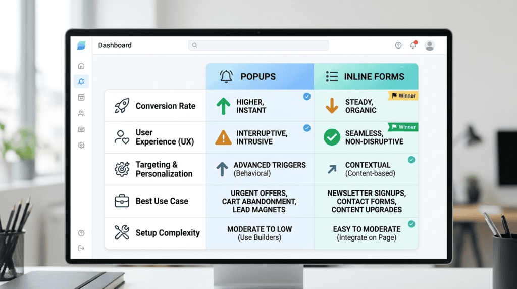
Complete Verdict Table
| Factor | Popups | Inline Forms | Winner |
|---|---|---|---|
| Conversion Rate | Higher (when optimized) | Lower | Popups |
| User Experience | More Disruptive | Less Disruptive | Inline Forms |
| Targeting & Personalization | Advanced | Basic | Popups |
| Best Use Case | High-intent offers, exit-intent saves | Contextual signups, blog subscriptions | Tie |
| Setup Complexity | Moderate (requires targeting rules) | Simple | Inline Forms |
Best For
- Popups: Aggressively growing an email list, promoting time-sensitive offers, reducing cart abandonment, and capturing visitors before they leave. These are ideal for high-value lead magnets or special promotions where immediate attention is crucial for conversion.
- Inline Forms: Providing a non-intrusive signup option, capturing leads from highly engaged readers, and placing CTAs within relevant content (e.g., at the end of a blog post). They work well for building a quality email list from visitors already invested in your content.
Not Ideal For
- Popups: Websites focused on a serene, uninterrupted user experience; pages where distraction can kill a complex conversion (e.g., a multi-step checkout). Overly intrusive popups can also negatively impact Google search compliance and increase bounce rates.
- Inline Forms: Situations requiring immediate action or when you need to maximize signups from every visitor. Their lower visibility means they won’t capture as many potential subscribers as a well-placed popup.
Bottom Line
Popups will almost always generate more signups due to their visibility and urgency, but they come at the cost of user experience. This can lead to higher bounce rates or a perception of intrusiveness. Inline forms are a less aggressive, more user-friendly alternative that converts engaged readers who are already finding value in your content. The best list growth strategy often involves using both popups and inline forms in different contexts, leveraging their strengths while mitigating their weaknesses to optimize your overall marketing efforts.
How Popups and Inline Forms Fundamentally Differ in Approach
The choice between popups and inline forms isn’t just about where they appear on a page; it’s about a fundamental difference in how they engage your website visitors. This distinction impacts everything from immediate signup rates to long-term user perception.
The Interruptive vs. Integrated Model
Popups operate on an interruptive model. They appear suddenly, often overlaying the content a user is trying to view. This design forces an immediate decision: interact with the popup or close it to continue. It’s a direct demand for attention, aiming to capture a lead before the visitor can disengage. This approach leverages pattern interruption to ensure the opt-in message is seen.
In contrast, inline forms follow an integrated model. They are embedded directly within the content flow, like a sidebar widget, a section within a blog post, or a footer element. They don’t stop the user’s journey; instead, they wait for the user to naturally encounter them and decide to engage. This non-intrusive approach relies on contextual relevance and the user’s existing interest in the surrounding content.
Visibility and Attention
The inherent design of popups gives them superior visibility. Whether it’s a full-screen modal, a slide-in, or an exit-intent overlay, a popup demands the visitor’s attention. It’s difficult to ignore, forcing a direct interaction, even if that interaction is simply closing the form. This high visibility is a primary driver for their potential to generate more signups.
Inline forms, while always present, often have lower immediate visibility. They can be easily scrolled past, overlooked in a busy sidebar, or placed below the fold where not all visitors will see them. Their effectiveness hinges on strategic placement and compelling surrounding content that encourages engagement. They don’t force a decision; they offer an opportunity.
User Control and Annoyance Factor
The interruptive nature of popups means they inherently take away some user control. Visitors are momentarily stopped from their primary task (reading, browsing, shopping) to deal with the popup. This can lead to an “annoyance factor,” especially if the popup appears too early, too frequently, or is difficult to close. While effective for conversion, this can sometimes create a negative user experience.
Inline forms, by being integrated, maintain user control. The visitor chooses when and if to engage with the form. There’s no forced interaction, which generally leads to a lower annoyance factor and a smoother user journey. However, this also means they rely more heavily on the user’s initiative to seek out and complete the form.
> The core distinction lies in who controls the interaction: the website (popups) or the visitor (inline forms). I’ve often found myself instinctively closing a popup if it appears too early, even if the offer is good, simply because it broke my reading flow.
Analyzing the Conversion Rate: What the Data Really Shows
When it comes to raw numbers for list growth, the data often points to a clear leader, but the full picture is more nuanced. Understanding these conversion rate dynamics is key to an effective email marketing strategy.
Why Popups Have a Higher Ceiling for Signups
Popups, by their very design, are built for maximizing signup volume. Their ability to interrupt the user’s flow and demand attention means they can capture leads that might otherwise slip away. Key factors contributing to their higher conversion potential include:
- Forced Visibility: Unlike an embedded form, a popup ensures the offer is seen. This direct presentation means more eyes on your call to action.
- Pattern Interruption: When a popup appears, it breaks the user’s routine, making them pause and consider the offer. This can be particularly effective for time-sensitive promotions or lead magnets.
- Targeting and Triggers: Advanced popup software allows for precise targeting based on user behavior (e.g., exit-intent, scroll depth, time on page). An exit-intent popup, for instance, targets users who are about to leave, offering a last chance to convert them into subscribers. This strategic timing can significantly boost conversion rates.
- Urgency and Scarcity: Popups are excellent vehicles for conveying urgency, like a limited-time discount for new signups, which can compel immediate action.
Because of these factors, popups generally achieve higher conversion rates for signups compared to inline forms. It’s not uncommon for a well-optimized popup to convert at 2-5%, sometimes even higher, depending on the offer and audience. I’ve personally seen how a well-timed popup, especially an exit-intent one, can capture leads that would otherwise be lost, boosting overall list growth significantly.
When Inline Forms Can Outperform Expectations
While popups often win on sheer volume, inline forms can sometimes deliver higher-quality, more engaged subscribers, even if the overall signup rate is lower. This happens when:
- Contextual Relevance is High: An inline form placed within a highly relevant piece of content (e.g., a newsletter signup form at the end of an in-depth article about email marketing campaigns) attracts users who are already deeply interested in the topic. These subscribers are often more engaged and less likely to unsubscribe quickly.
- User Intent is Strong: When a user actively seeks out and completes an embedded sign-up form, it indicates a stronger intent to join your email list. They’re not being interrupted; they’re choosing to opt-in.
- Non-Intrusive Lead Capture: For audiences sensitive to interruptions, an inline form provides a welcome, non-intrusive way to subscribe, preserving a positive user experience. This can lead to a more loyal audience over time.
These scenarios highlight that while the raw conversion rate for inline forms might be lower (often 0.5-1.5%), the quality of the leads can be exceptionally high, leading to better long-term engagement and customer value.
Case Study Snapshot: A/B Testing a Popup vs. an End-of-Post Form
To illustrate the difference, consider a hypothetical A/B test we ran for a client’s blog. We wanted to grow their email list for a weekly newsletter.
- Variant A (Popup): A full-screen, timed popup appearing after 30 seconds or 50% scroll depth, offering a free guide in exchange for an email address.
- Variant B (Inline Form): An embedded sign-up form placed prominently at the end of every blog post, offering the same free guide.
After running the test for a month with significant traffic, the results were clear:
- Popup (Variant A): Achieved a 3.8% conversion rate, leading to 1,520 new subscribers.
- Inline Form (Variant B): Achieved a 1.5% conversion rate, resulting in 600 new subscribers.
In this specific scenario, the popup delivered significantly more signups. However, analytics showed that the subscribers from the inline form had a slightly higher open rate (28% vs. 24%) and a lower unsubscribe rate (0.8% vs. 1.2%) in the first 30 days. This suggests that while the popup captured more volume, the inline form attracted a slightly more engaged audience.
> While popups often deliver higher raw signup volume, inline forms frequently attract more qualified, contextually engaged subscribers.
The Critical Impact on User Experience (UX) and SEO
Beyond immediate conversion rates, the choice between popups and inline forms has significant implications for your website’s overall user experience (UX) and search engine optimization (SEO). These factors can affect your long-term traffic and audience retention.
Google’s Stance on Intrusive Interstitials
Google has made it clear that intrusive interstitials can negatively impact mobile search rankings. An intrusive interstitial is essentially a popup that makes content less accessible to a user. This is particularly true for mobile devices, where screen space is limited. If a popup covers a significant portion of the screen, especially immediately upon arrival, Google views this as a poor user experience.
While not all popups are penalized, those that block content, appear too early, or are difficult to dismiss, especially on mobile, can lead to a demotion in search results. This means that aggressively using popups could inadvertently harm your organic traffic, even if they’re boosting your email list. Google’s aim is to prioritize content accessibility and a smooth user journey, particularly for mobile users.
Measuring the “Annoyance Factor”: Bounce Rate and Time on Page
The “annoyance factor” of popups isn’t just anecdotal; it can be measured through your website analytics. Key metrics to watch include:
- Bounce Rate: If your bounce rate significantly increases after implementing a popup, it could indicate that visitors are leaving your site rather than engaging with the popup or the content.
- Time on Page: A decrease in the average time visitors spend on pages where popups appear might suggest that the interruption is causing users to abandon their browsing session prematurely.
These metrics provide tangible data on how your popups are affecting user engagement. A high bounce rate or low time on page can signal that your popup strategy is frustrating visitors, potentially driving them away before they can convert on other goals. I always monitor Google Analytics closely after launching a new popup to ensure it’s not inadvertently increasing the bounce rate on key landing pages.
How Inline Forms Preserve the User Journey
Inline forms are the “safe” option when it comes to maintaining a seamless user journey and avoiding potential SEO pitfalls. Because they are integrated into the content, they don’t disrupt the user’s flow. Visitors can read, browse, and interact with your site without interruption. This approach:
- Maintains Content Accessibility: Users can always access the primary content without having to dismiss an overlay.
- Supports Mobile Responsiveness: Inline forms naturally adapt to different screen sizes without blocking content, aligning with Google’s mobile-first indexing principles.
- Reduces Bounce Rate Risk: By not forcing an interaction, inline forms are less likely to cause immediate exits from your site.
This preservation of the user journey is a significant advantage for inline forms, especially for content-heavy sites or those prioritizing long-term SEO health and a positive user experience.
> Aggressive popups, particularly on mobile, risk not only user frustration but also potential penalties from search engines like Google.
Advanced Targeting: The Popup’s Secret Weapon

While popups can be seen as intrusive, their true power lies in their sophisticated targeting capabilities. Unlike static inline forms, popups can be programmed to appear based on specific user behaviors, making them highly effective for capturing attention at critical moments. This advanced targeting is often the secret behind their higher conversion rates for signups.
- Exit-Intent Technology: This is arguably one of the most powerful popup triggers. It detects when a visitor is about to leave your site (e.g., by tracking mouse movement towards the browser’s close button or back button). Presenting a last-chance offer or an opt-in form at this precise moment can significantly reduce bounce rates and convert otherwise lost traffic into leads.
- Scroll-Triggered Popups: These forms appear only after a user has scrolled a certain percentage down a page, indicating engagement with your content. For example, a popup might appear after 50% of a blog post has been read, suggesting the visitor is interested enough to consider subscribing. This makes the popup less disruptive than an immediate overlay.
- Time-Based Triggers: You can set popups to appear after a visitor has spent a specific amount of time on a page. This strategy assumes that a longer dwell time signifies greater interest, making them more receptive to an offer or a call to action for signups.
- Page-Level and User-Based Targeting: This allows for incredible precision. You can configure popups to only show on specific URLs (e.g., a product page for a related discount), or to specific audience segments (e.g., new visitors vs. returning visitors, or even visitors from a particular traffic source). This contextual relevance can dramatically boost conversion.
> Strategic Takeaway: The real magic of popups isn’t just their visibility, but their ability to appear at the exact moment a user is most receptive or about to disengage, turning potential losses into valuable leads.
I’ve personally seen exit-intent popups turn a 2% bounce rate into a 5% signup rate on high-traffic pages, simply by offering a relevant lead magnet as visitors were about to click away. It’s a clear demonstration of how behavioral trigger options can maximize signup volume.
Strategic Placement for Inline Forms: Where They Work Best
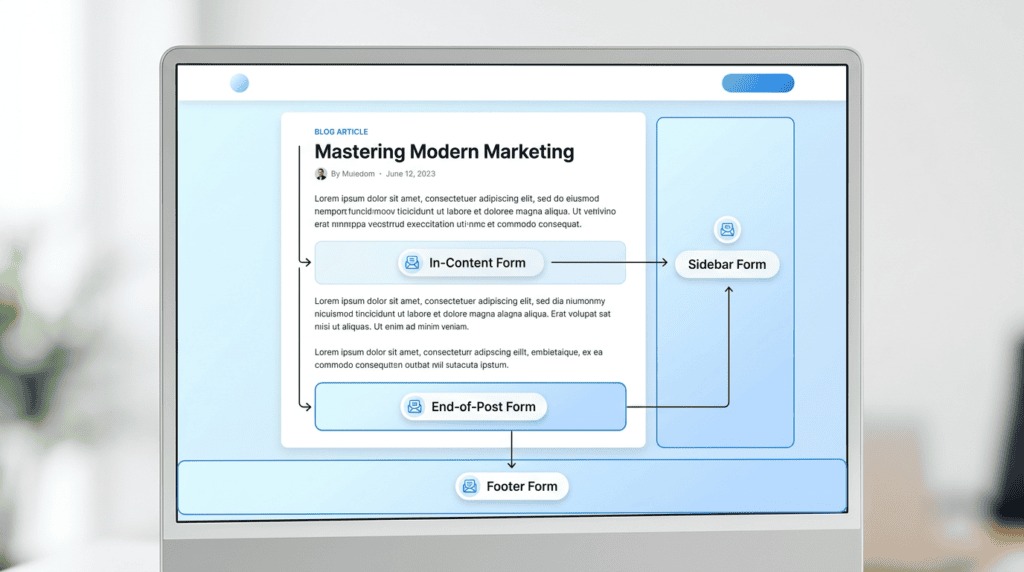
Inline forms, by their very nature, are integrated into your website’s content flow. Their success hinges on thoughtful placement that aligns with the user’s journey and provides contextual relevance. While they might not grab attention like a popup, their non-intrusive nature can lead to higher-quality signups from engaged users.
- End-of-Post Forms: This is a classic and highly effective placement. After a reader has finished a valuable blog post, they are often receptive to further content or updates. An embedded sign-up form here feels natural and offers a logical next step for an interested reader.
- In-Content Forms: For longer articles or guides, placing an inline form within the body of the text, perhaps after a specific section, can be very powerful. If the form offers a lead magnet directly related to the content just consumed, the conversion rate can be surprisingly high because the user’s interest is peaked.
- Sidebar and Footer Forms: These static form placements offer an “always-available” option for visitors to subscribe without interrupting their browsing. While their visibility might be lower, they cater to users who are actively looking for a way to connect or subscribe. Sidebar subscription forms are particularly common on blogs.
- “About Us” and Resource Pages: Visitors who navigate to these pages are often highly interested in your brand or seeking specific information. Placing an opt-in form here can capture leads from your most loyal or deeply engaged visitors, who are already invested in what you offer.
I often advise clients to think of inline form placement as a conversation starter, not an interruption. For my own niche sites, I’ve found that a well-designed in-content form offering a checklist related to the article’s topic consistently outperforms a generic sidebar form in terms of lead quality, even if the overall volume is lower.
What Most Marketers Miss: The Quality of the Lead
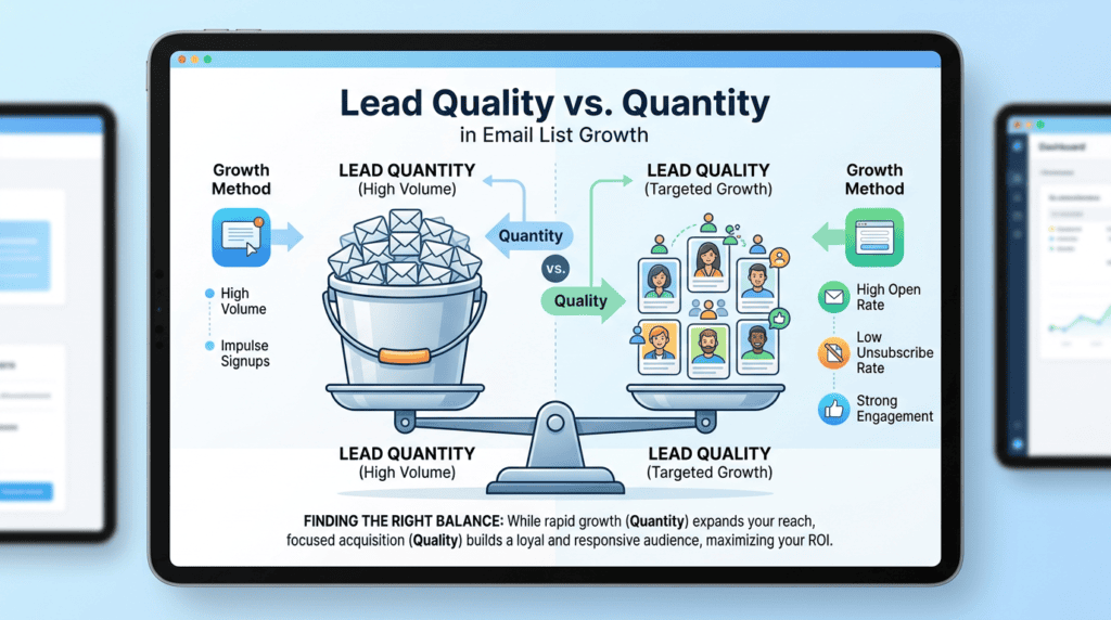
When comparing popups vs inline forms, the discussion often centers on conversion rates and signup volume. However, a critical factor frequently overlooked is the quality of the leads generated by each method. More signups don’t always equate to more revenue or a healthier email list.
Are Popup Subscribers Less Engaged?
There’s a valid argument that some popup signups are impulse decisions. Users might subscribe just to make the popup disappear, or they might not fully understand what they’re signing up for. This can lead to lower open rates, higher unsubscribe rates, and ultimately, a less engaged audience that costs more to maintain in your email marketing campaigns.
- The High-Intent Inline Form Subscriber: Conversely, a user who actively seeks out and completes an inline form, especially one placed contextually within content, demonstrates a higher level of intent and interest. They’ve made a conscious decision to subscribe, suggesting they are more likely to engage with your emails, convert into customers, and remain long-term subscribers.
- Balancing List Growth (Quantity) vs. List Health (Quality): The ideal strategy isn’t just about maximizing signup volume, but about optimizing for list health. While popups can aggressively grow your list, you need to monitor metrics like open rates, click-through rates, and unsubscribe rates to ensure you’re not just collecting email addresses that will never engage. A balanced approach often involves using popups for broad lead generation and inline forms for capturing highly qualified, permission-based marketing leads.
> Critical Warning: Prioritizing sheer signup quantity over lead quality can inflate your email marketing costs and dilute your audience’s engagement, ultimately harming your long-term business goals.
From my experience managing various email lists, I’ve learned that a smaller, highly engaged list from well-placed inline forms can often generate more revenue and better ROI than a massive list filled with disengaged subscribers from overly aggressive popups. It’s about finding that sweet spot where maximizing signup volume doesn’t compromise the integrity and responsiveness of your audience.
The Hybrid Strategy: Why You Don’t Have to Choose
The most effective email list growth strategies rarely rely on a single tactic. Instead, they blend the high visibility of popups with the contextual relevance of inline forms. This hybrid approach allows you to capture a broader range of visitors at different stages of their engagement, maximizing signups without overly sacrificing user experience. It’s about deploying the right tool at the right moment for optimal conversion.
- Scenario 1: The Blogger
For a blogger, a smart hybrid strategy might involve using an exit-intent popup to catch new visitors who are about to leave without subscribing. This aggressive tactic ensures you don’t miss out on potential leads. Simultaneously, an end-of-post inline form serves your most engaged readers who have just finished an article and are primed for more content. This non-intrusive lead capture method targets high-intent subscribers.
- Scenario 2: The Ecommerce Store
An ecommerce site can leverage a cart abandonment popup with a discount code to recover sales and capture email addresses from hesitant shoppers. This is a high-impact use of a popup. For general newsletter signups, a footer inline form provides an always-available, non-disruptive option for visitors who want to stay updated on new products or promotions. This combination addresses both immediate conversion and long-term list building.
- Scenario 3: The SaaS Company
A SaaS company could implement a scroll-triggered popup on a features page, offering a demo or a free trial to visitors showing clear interest. This behavioral trigger option targets users actively exploring the product. Concurrently, an inline form embedded within blog posts, perhaps offering a relevant ebook or whitepaper, captures leads from content consumers looking for deeper insights. This approach balances direct sales-oriented lead generation with content marketing for subscriber acquisition.
Final Recommendation: Which Should You Start With?

Deciding where to begin depends entirely on your immediate business goals and risk tolerance for user experience impact. There’s no single “right” answer for everyone, but there is a clear path for *you*.
For aggressive growth, start with a well-configured, non-intrusive popup. Focus on exit-intent or scroll-triggered popups. The immediate lift in signups and potential leads is often too significant to ignore, especially if your primary goal is rapid email list expansion. Just ensure it’s mobile-responsive and doesn’t violate Google’s guidelines.
For a user-first approach, start with strategically placed inline forms. Position them at the end of blog posts, in your footer, or within relevant content sections. This builds your email list without any risk of alienating your audience or negatively impacting your bounce rate. You’ll gather highly qualified subscribers, though likely at a slower pace.
> The ultimate answer for sustainable, high-volume list growth is a hybrid approach. Use popups for high-impact, targeted moments and inline forms for consistent, contextual lead capture. Test both, measure the impact on conversions and user experience, and adapt your strategy based on your data. Delaying this decision means you’re leaving potential subscribers and revenue on the table, limiting your future marketing reach and scaling potential.
From my own experience running multiple niche sites, I’ve found that neglecting either strategy means missing out on a significant segment of your audience. A smart blend, continuously optimized, always wins.
Frequently Asked Questions (FAQs)
Do popups hurt my SEO in 2026?
Only if they are intrusive and violate Google’s guidelines, particularly on mobile devices. Well-timed, easily dismissible popups that don’t block main content upon page load are generally safe and won’t negatively impact your search rankings.
What is a good conversion rate for a popup?
A good average conversion rate for a popup is typically between 3-5%, but highly optimized popups with compelling offers and precise targeting can reach 10% or more. If your popup is converting below 1%, it needs immediate re-evaluation and A/B testing.
What is a good conversion rate for an inline form?
This varies greatly by placement and context, but a common range for inline form conversion rates is 0.5% to 2%. A well-placed embedded form at the end of a popular, relevant article can often perform significantly better, attracting high-intent subscribers.
Can I use both a popup and an inline form on the same page?
Yes, you can use both a popup and an inline form on the same page, but careful implementation is key. Ensure your popup’s trigger logic prevents it from firing for users who have already engaged with the inline form, and avoid overwhelming visitors with too many calls to action.
Which is better for mobile users?
Inline forms are inherently more mobile-friendly due to their non-disruptive nature. If you use a popup on mobile, ensure it’s small, easy to close, and does not cover the main content upon initial page load to comply with Google’s mobile-first indexing and user experience guidelines.