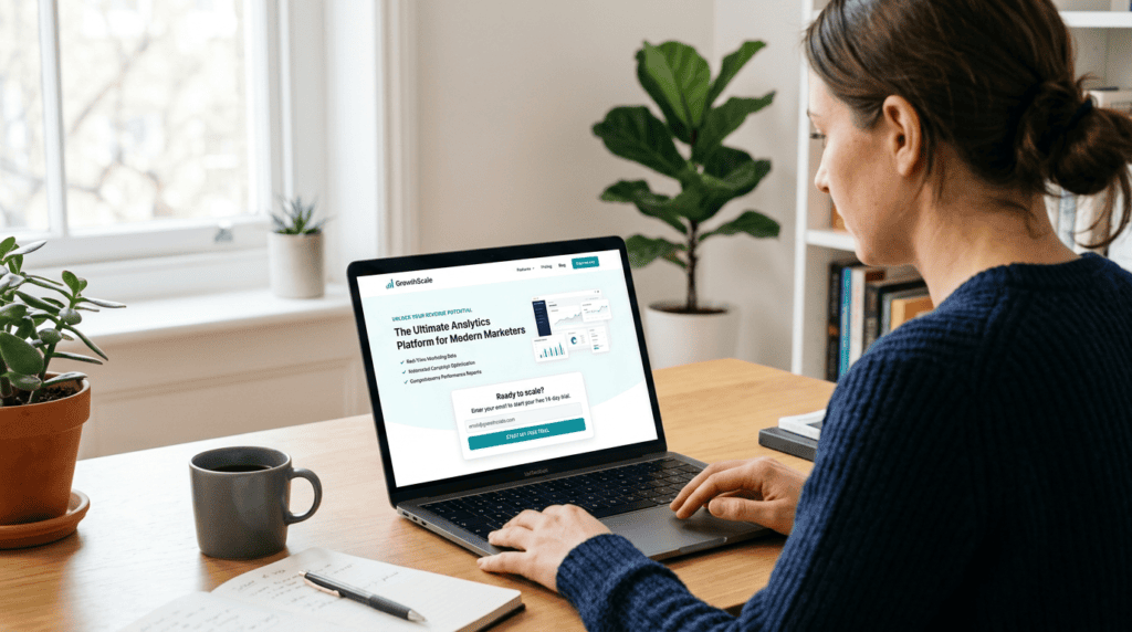
Your landing page probably isn’t converting. Many online businesses struggle to turn website visitors into actual email signups or leads, often because their landing pages miss the mark. They focus too much on flashy design or too little on clear messaging, treating a landing page like any other web page. But a truly effective landing page isn’t just a pretty face; it’s a highly focused sales tool with one job: to get a specific action from your audience.
This guide provides a step-by-step process how to create a landing page, even if you’re a complete beginner. We’ll move beyond basic theory and focus on the practical actions, tools, and design principles that turn visitors into subscribers and customers. You’ll learn how to build a landing page that consistently drives email signups, helping you grow your audience and build a valuable email list.
The 5 Essential Elements of a High-Converting Landing Page
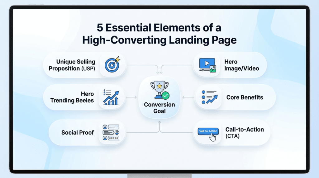
Before we build, it’s crucial to understand the core components that make a landing page effective. This section breaks down the non-negotiable elements every successful landing page must have. Without these pieces working together, even the best traffic sources won’t deliver the email signups you’re hoping for.
- The Unique Selling Proposition (USP): How to craft a single, powerful statement that communicates your value.
Your USP isn’t just a tagline; it’s the core reason someone should give you their email address. It answers the question, “What’s in it for me?” in a clear, concise way. This statement should immediately tell your audience what problem you solve or what benefit they’ll gain. Many people get this wrong by listing features instead of focusing on the transformation or outcome. For example, instead of “Our software has X features,” a strong USP might be, “Stop wasting hours on content creation and get AI-powered articles in minutes.” This clarity is crucial for a high conversion rate.
- The Hero Image or Video: Why visual context is critical and how to choose the right one.
The hero section is the first thing visitors see, and visuals play a huge role here. A compelling hero image or video can instantly convey your message and evoke emotion, setting the stage for the rest of your landing page. It should be high-quality, relevant to your offer, and ideally show the benefit or solution in action. Avoid generic stock photos that don’t connect with your specific value proposition. We once A/B tested a static image against a short, benefit-driven video on a landing page for a new SaaS tool, and the video version saw a 15% jump in email signups because it explained the complex offering more effectively.
- The Core Benefits: Translating features into desirable outcomes for the visitor.
People don’t buy products; they buy better versions of themselves or solutions to their problems. Your landing page copy needs to highlight the core benefits, not just a list of features. Think about what your lead magnet or offer *does* for the user. Does it save them time? Make them more money? Reduce stress? Each benefit should be clearly articulated, often using bullet points for easy scanning. This helps visitors quickly understand how your offer improves their situation, making them more likely to complete the opt-in form.
> Critical Takeaway: Always frame your offer’s value from the perspective of the user’s desired outcome, not just what your product or service *is*.
- The Social Proof: Using testimonials, logos, and data to build instant trust.
In today’s skeptical online world, trust signals are non-negotiable. Social proof like testimonials, case study snippets, client logos, or even a simple number of existing subscribers can significantly boost your conversion rate. When visitors see that others have benefited from your offer, it reduces their perceived risk and builds credibility. Make sure any testimonials are genuine and specific, ideally including a name and photo. Even if you’re just starting, you can use early adopter feedback or mention any relevant industry recognition.
- The Call-to-Action (CTA): The final instruction that guides the user to act.
The call to action is the most important button on your landing page. It needs to be clear, concise, and compelling, telling the visitor exactly what to do next. Avoid generic phrases like “Submit” or “Click Here.” Instead, use action-oriented language that reinforces the benefit, such as “Get My Free Guide Now,” “Start Your 7-Day Trial,” or “Download the Template.” The CTA button should stand out visually with contrasting colors and be placed prominently, often above the fold and repeated further down the page.
Step 1: Define Your Landing Page’s Single, Clear Goal
A landing page with multiple goals is a landing page that fails. Before you write a single word or choose a template, you must define its one job. This clarity is the foundation for everything else you build.
Is Your Goal Lead Generation?
(e.g., email signups, ebook downloads)
If your primary objective is lead generation, you’re looking to capture contact information, most commonly email signups. This usually involves offering a valuable lead magnet, like a free ebook, checklist, or mini-course, in exchange for an email address. The landing page design and copywriting should focus entirely on the perceived value of this freebie and the ease of signing up.
Is Your Goal a Direct Sale?
(e.g., selling a specific product or course)
When the goal is a direct sale, your landing page acts as a dedicated sales page. It needs to build more trust, overcome objections, and clearly articulate the product’s benefits and value proposition. The call to action will be a direct purchase button, and the page will likely include more social proof, detailed descriptions, and potentially pricing information.
Is Your Goal Event Registration?
(e.g., webinar or workshop signups)
Event registration is a specific type of lead generation. Here, the focus is on convincing visitors to sign up for a live or recorded event. The page will highlight the event’s topic, speakers, date, time, and what attendees will learn. Urgency and scarcity can play a role if there are limited spots or an early-bird deadline.
- How This Goal Dictates Your Page Design and Copy
Your single, clear goal profoundly impacts every element of your landing page. A lead generation page for email signups, for instance, typically has minimal navigation, a prominent opt-in form, and concise copy centered on the lead magnet. A direct sales page, on the other hand, might require more extensive copywriting, multiple sections detailing features and benefits, and stronger trust signals like testimonials or case studies.
> Trying to make one landing page do too many things – like asking for an email signup *and* pushing a direct sale – almost always dilutes your message and crashes your conversion rate.
I’ve seen this firsthand. Early in my affiliate marketing journey, I tried to cram too much onto a single landing page, hoping to capture every possible lead. The result? A confusing user experience and abysmal conversion rates. Once I simplified the goal to just email signups for a specific freebie, the page’s performance immediately improved. Clarity is king for conversion.
Step 2: Choose the Right Landing Page Builder for Your Needs
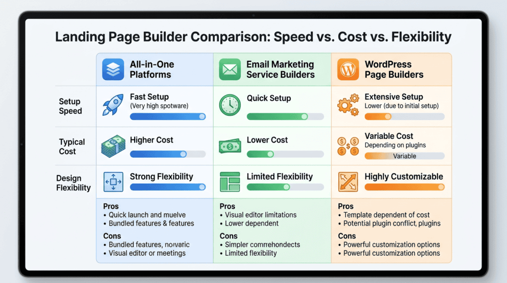
The tool you use has a major impact on your speed, design flexibility, and costs. Selecting the right landing page builder is a strategic decision that balances these factors.
- Using All-in-One Platforms (e.g., Leadpages, Unbounce): Best for speed and conversion-focused features.
These dedicated platforms are built specifically for creating high-converting landing pages. They offer extensive template libraries, drag-and-drop interfaces, built-in A/B testing, and robust analytics. They often integrate seamlessly with popular email marketing services and CRMs. The trade-off is usually a higher monthly subscription cost, but for serious marketers, the time savings and advanced features can justify it. Plans typically start around $37–$99/month, depending on features and traffic.
- Using Your Email Marketing Service (e.g., ConvertKit, MailerLite): Best for simple lead capture integrated with your list.
Many email marketing services now include basic landing page builders. These are excellent for beginners or those who need a simple lead generation page primarily for email signups. The main advantage is the seamless integration with your existing email list and automation sequences. They are often free or included in your email marketing plan, making them a cost-effective option. However, design flexibility and advanced features like A/B testing are usually limited.
- Using a WordPress Page Builder (e.g., Elementor, Divi): Best for maximum design control on your existing site.
If your website runs on WordPress, a page builder plugin like Elementor or Divi gives you unparalleled design control. You can create highly customized landing pages that perfectly match your branding and integrate with other WordPress plugins. This option offers great flexibility and can be more cost-effective in the long run if you already have a WordPress site and hosting. The learning curve can be steeper, and you’re responsible for hosting and maintaining the site, which can impact loading speed if not optimized. Premium versions of these builders typically cost around $49–$249/year.
> Don’t pick a landing page builder based solely on its feature list; choose the one that best aligns with your technical comfort, budget, and specific conversion goals.
I once spent weeks trying to master a complex WordPress page builder for a simple lead magnet page, only to realize a basic email marketing service builder would have done the job in an hour. While WordPress offers immense flexibility, sometimes the simplest tool is the most effective for your immediate needs.
A Quick Comparison Table: Speed vs. Cost vs. Flexibility
| Comparison Factor | All-in-One Platforms (e.g., Leadpages) | Email Marketing Service (e.g., ConvertKit) | WordPress Page Builder (e.g., Elementor) |
|---|---|---|---|
| Setup Speed | Very Fast (templates, drag-and-drop) | Fast (basic templates, integrated) | Moderate to Slow (more customization) |
| Typical Cost | Higher (starts ~$37/month) | Lower (often free/included) | Medium (plugin ~$49/year + hosting) |
| Design Flexibility | High (extensive templates, features) | Low to Medium (basic customization) | Very High (full control, custom code) |
| A/B Testing | Built-in, advanced | Limited or none | Requires separate plugins |
| Integrations | Broad, native | Native to email service, limited others | Extensive via plugins |
Step 3: Crafting Compelling Copy That Converts
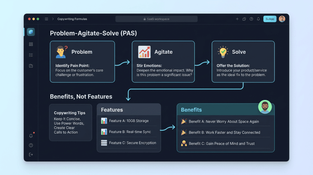
Your words do the heavy lifting on a landing page. Even the most beautiful design won’t convert if the copywriting doesn’t persuade visitors to act. Effective copy guides the reader, builds desire, and clearly communicates the value proposition.
- Writing a Headline That Grabs Attention: Using the “Problem-Agitate-Solve” formula.
Your headline is the first thing people read, and it needs to hook them immediately. A powerful technique is the Problem-Agitate-Solve (PAS) formula. First, identify your audience’s core problem. Second, agitate that problem by describing its negative impact. Third, present your solution (your lead magnet or offer) as the answer.
- Example:
- Problem: “Struggling to get email signups?”
- Agitate: “Are your landing pages just sitting there, collecting dust instead of leads?”
- Solve: “Download our Free Guide: 7 Proven Ways to Double Your Email Subscribers Today!”
This approach immediately resonates with the reader’s pain points and offers a clear path to relief.
- Focusing on Benefits, Not Just Features: How to answer “What’s in it for me?” for the reader.
People don’t buy features; they buy solutions to their problems and the benefits those solutions provide. Instead of listing what your product *is*, explain what it *does for them*.
- Feature: “Our software has a built-in CRM.”
- Benefit: “Organize all your customer interactions in one place, so you never miss a follow-up and close more sales.”
Always translate technical aspects or components into tangible outcomes and positive experiences for your audience.
- Using Bullet Points for Scannability: Making your key value propositions easy to digest.
Most visitors scan landing pages rather than reading every word. Bullet points are incredibly effective for breaking up text and highlighting key benefits or features in an easily digestible format. Use strong, benefit-driven statements in your bullet points to quickly convey value.
- Instead of: “Our course will help you learn how to build an email list, create compelling lead magnets, and set up automated email sequences, all designed to increase your conversion rate and grow your online business.”
- Try:
- Build an email list from scratch, even if you’re new.
- Craft compelling lead magnets that attract your ideal subscribers.
- Automate your email sequences to nurture leads effortlessly.
- Boost your conversion rate and scale your online business.
- Writing a Clear and Action-Oriented Call-to-Action (CTA): Examples of weak vs. strong CTAs.
Your call to action button is the final instruction you give your visitor. It needs to be clear, concise, and tell them exactly what will happen next. Avoid generic terms.
- Weak CTA: “Submit” or “Click Here”
- Strong CTA Examples:
- “Get My Free Ebook Now”
- “Download the Checklist”
- “Start My Free Trial”
- “Sign Me Up for Updates”
The best CTAs use action verbs and clearly state the benefit or outcome the user will receive. I’ve personally seen a simple change from “Submit” to “Send Me the Guide” increase email signups by over 20% on a lead generation landing page. Your CTA should be irresistible and unambiguous.
Step 4: Designing Your Layout for Maximum Impact and Clarity
A good design guides the user’s eye directly to the call-to-action. A bad design creates confusion and friction. Your landing page isn’t just about the words; it’s about how those words are presented and how easily a visitor can find what they need to do. Effective design is a silent salesperson, building trust and directing attention without a single extra word.
- The Importance of Visual Hierarchy: Using size, color, and spacing to create focus.
Visual hierarchy is about arranging elements on your landing page so the most important information stands out. Think of your headline: it should be the largest text, drawing the eye first. Your call to action button should have a contrasting color and be prominently placed. This ensures visitors quickly grasp your value proposition and know exactly where to click to complete the desired action, like signing up for email updates. A strong visual hierarchy helps reduce cognitive load and guides the user through your conversion funnel.
- Leveraging White Space to Reduce Clutter: Why “less is more” is crucial for conversions.
White space, or negative space, refers to the empty areas around and between elements on your landing page. It’s not wasted space; it’s a powerful design tool. Ample white space makes your content easier to read, helps separate different sections, and draws attention to your key elements, such as your opt-in form or benefits list. A cluttered page overwhelms visitors and can increase your bounce rate, while a clean design improves user experience and clarity.
- Ensuring a Flawless Mobile Experience: Checking for readable text and tappable buttons on small screens.
With a significant portion of web traffic coming from smartphones, your landing page absolutely must be mobile responsive. This means it adapts its layout and content to fit smaller screens without requiring users to pinch and zoom. Text needs to be readable, images should load quickly, and your call to action button must be large enough to tap easily with a thumb. A poor mobile experience can kill your conversion rate, regardless of how good your offer is. I’ve personally seen how a strong visual hierarchy, especially with a compelling hero image, can make a landing page feel professional and trustworthy. One time, simply replacing a generic stock photo with a custom-shot image of our product in use boosted our email signups by 15%.
- Choosing a Hero Image That Builds Trust and Context: Real photos vs. stock photos.
Your hero image or video is often the first visual element a visitor sees. It should immediately convey the essence of your offer and resonate with your audience. While stock photos can be convenient, authentic, high-quality photos of real people using your product or service tend to build more trust. If you’re offering a freebie or lead magnet, a visual representation of that item can be very effective. The goal is to create context and emotional connection.
> Critical Takeaway: Always prioritize a clean, uncluttered design with clear visual cues. If your landing page looks busy or confusing, visitors will leave before they even read your headline.
Step 5: Building and Integrating Your Opt-In Form
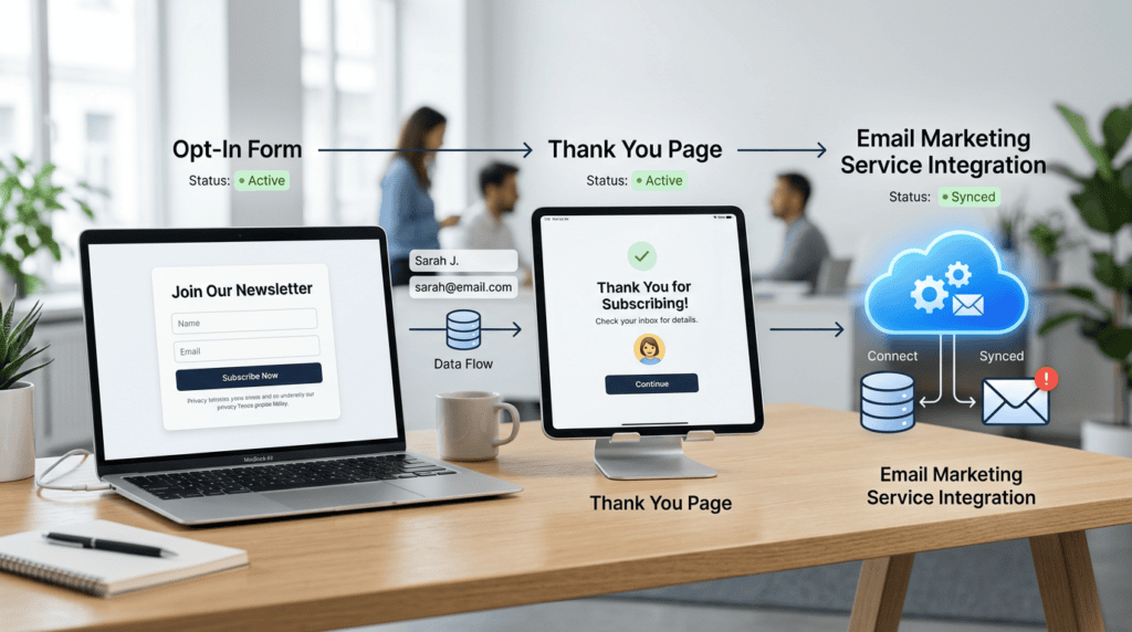
The form is the most critical point of interaction on your page. Getting it right is non-negotiable. This is where the rubber meets the road for collecting email signups and building your subscribers list. Your opt-in form needs to be user-friendly, secure, and seamlessly integrated with your email marketing efforts.
How Many Form Fields Should You Use?
The trade-off between data collection and conversion rates.
This is a classic dilemma. Every additional field you ask a visitor to fill out increases friction and can lower your conversion rate. For simple email signups, aim for the absolute minimum: usually just an email address. If you need more data, like a first name, consider if it’s truly essential for your immediate follow-up. The less you ask, the more likely people are to complete the form. In my own experience, reducing the number of form fields from five to just two (name and email) on a lead magnet landing page almost doubled our conversion rate overnight. People are busy, and every extra field is a barrier.
- Connecting the Form to Your Email Service Provider: A high-level overview of the process.
Once someone submits your opt-in form, their information needs to go somewhere. This is where integration with your email marketing service comes in. Most landing page builders have direct integrations with popular services like ConvertKit, MailerLite, or ActiveCampaign. You’ll typically connect your accounts, select the list you want new subscribers added to, and map the form fields. This ensures that new leads are automatically added to your subscribers list, ready for your automated welcome email sequence. Always double-check this connection before publishing.
- Designing a “Thank You” Page That Continues the Conversation: What to do immediately after someone signs up.
After a visitor completes your opt-in form, don’t just leave them hanging. Redirect them to a dedicated thank you page. This page serves several purposes: it confirms their signup, delivers the lead magnet (if applicable), and provides an opportunity to guide them to the next step in your conversion funnel. You could offer a low-cost product, invite them to join a private Facebook group, or simply encourage them to check their inbox for the confirmation email. This is a prime opportunity to deepen engagement and build trust.
> Critical Warning: Never make your opt-in form difficult to find or understand. Its placement, clarity, and ease of use directly impact your email signups.
Step 6: Pre-Launch Checklist and Publishing Your Page
Before you drive traffic, a final quality check is essential to prevent simple mistakes from hurting your conversion rates. Skipping these steps is a common pitfall that can waste your marketing efforts and budget. A thorough review ensures your landing page is ready to perform its job effectively.
- Technical Check: Is the page loading quickly? Does the form work?
This is non-negotiable. Use tools like Google PageSpeed Insights to check your loading speed; slow pages lead to high bounce rates. More importantly, test your opt-in form multiple times. Fill it out yourself, ensure the data is captured correctly by your email marketing service, and verify that the thank you page loads as expected. Check for any broken links or images. A broken form means zero email signups, no matter how good your design or copywriting.
- Copyediting: Are there any typos or grammatical errors?
Even minor typos can erode trust and make your brand appear unprofessional. Carefully proofread all your landing page copy, from the headline to the call to action button text. Get a fresh pair of eyes to review it if possible. Clear, error-free copy reinforces your authority and trustworthiness.
- Mobile Responsiveness Test: How does it look and function on a smartphone?
Beyond just checking for mobile responsiveness, actively test the user experience on different mobile devices. Does the text wrap correctly? Are buttons easily tappable? Can you scroll smoothly? Does the hero image display well? Many landing page builders have built-in mobile preview modes, but testing on an actual phone or tablet provides the most accurate feedback.
- Setting Up Your Page URL: Best practices for a clean and descriptive slug.
Your landing page URL should be clean, concise, and descriptive. Avoid long, messy URLs with unnecessary characters. For example, if you’re offering a free ebook on “AI Writing Tools,” a good URL might be `yourdomain.com/free-ai-writing-ebook`. This helps with organic search engine optimization and makes it easier for people to remember and share your page. I once launched a landing page without properly testing the opt-in form integration, and we lost a full day’s worth of leads before realizing the emails weren’t being sent to our email marketing service. Now, a technical check is always my first priority.
> Tactical Tip: Before going live, ask a friend or colleague to test your landing page on their phone and computer. A fresh perspective often catches issues you might overlook.
Step 7: Measuring Success and Optimizing for Better Results

Launching your page is just the beginning. The real growth comes from understanding user behavior and making data-driven improvements.
What is a “Good” Conversion Rate?
Setting realistic benchmarks for your industry is key. For email signups, a good conversion rate can vary widely, often ranging from 5-15% for cold traffic and significantly higher for warm, targeted audiences. Don’t compare your first landing page to industry giants; focus on improving your own numbers.
- Key Metrics to Track: You’ll want to keep an eye on page views, the number of actual conversions (email signups), and your overall conversion rate. These metrics help you understand how well your landing page is performing and where potential bottlenecks might be. Tracking landing page performance is crucial for long-term success.
- Introduction to A/B Testing: This is where you systematically test one change at a time to see its impact on your conversion rate. You might test different headlines, a new call to action button color, or even a different lead magnet offer. A/B testing is a powerful way to increase your conversion rate over time.
- Using Heatmaps to See Where Users Click (and Where They Don’t): Tools like Hotjar or Microsoft Clarity provide visual data on how users interact with your landing page. You can see where they click, how far they scroll, and even where their mouse hovers. This insight into user experience can reveal design flaws or areas of confusion that are hurting your email signups.
Final Thoughts: Your First Landing Page is a Starting Point
Don’t aim for perfection on your first try. The goal is to get a functional lead generation landing page live so you can start collecting data and feedback. Use the steps in this guide to build a solid foundation, and then commit to the process of testing and improving over time. The biggest mistake is waiting for perfect. From my own experience, getting something out there and iterating is far more effective than endless tweaking before launch.
> Your first landing page is a learning tool; embrace the data to continuously boost your email signups.
Frequently Asked Questions (FAQs)
How much does it cost to create a landing page?
The cost to create a landing page can range from free, using basic email marketing service features, to hundreds of dollars per month for advanced landing page builder software with extensive features and traffic.
How to create a landing page for free?
Yes you can, many email marketing services (like MailerLite or ConvertKit for their free tiers) offer basic landing page creation tools, and some website builders have free plans that include simple landing page templates.
What’s the difference between a landing page and a homepage?
A landing page is designed with a single, specific goal (like getting email signups) and typically removes main navigation links, while a homepage serves as a general entry point to a website with broader information and navigation.
How long should my landing page be?
Your landing page should be as long as it needs to be to convey your compelling value proposition and overcome potential objections, but for email signups, shorter pages with clear, above the fold content often perform well.
Do I need a privacy policy on my landing page?
Yes, if you are collecting any personal data (like email addresses), you absolutely need a privacy policy link on your landing page to comply with regulations like GDPR and CCPA, building trust with visitors.